

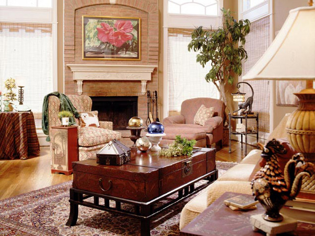
Most people err, not with color, but with value. Value is the relative lightness or darkness of a color. Often you'll see a space that is not balanced in terms of value: one side of the room is too dark (therefore, "weighty" or "heavy") versus the other side, which is light in value and tends to "float away" visually.
Try designing your interior space by replicating the color values of the outside world. After all, interior designs are basically our attempt to imitate Mother Nature, who is a great colorist!
Choose darker values of color for the floor (ground), medium values of color for the walls (trees and mountains) and light values of color for the ceiling (sky). If you divide your colors by value from dark to light as you decorate "vertically" in the room, you’ll get an interior design that looks good every time.

Development | Ra2Directory+ | Multimedia | Photography | Design


( Copyright © 2000/2025 Ra2D ™ All Rights Reserved. )